
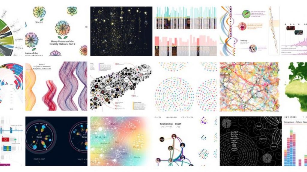
Las mejores infografías del año en Kantar Information is Beautiful Awards 2017
Un año más, los premios Kantar Information is Beautiful Awards nos muestran las mejores infografías, visualizaciones de datos, infografías interactivas y motion graphics del año.

Los Kantar Information is Beautiful Awards fueron creados en 2012 por el periodista y diseñador David McCandless con la colaboración de Aziz Cami, (Director Creativo en Kantar), y desde entonces premian la excelencia y la belleza de las infografías, la visualización de datos y el diseño de información.
En su sexta edición han repartido 11 Oros, 12 Platas, 14 Bronces y 11 Menciones de Honor. Kantar Information is Beautiful Awards cuenta con más de $20.000 en premios, cerca de 40 jueces ilustres y están compuestos por 13 categorías: Arts, Entertainment & Pop Culture, Current Affairs & Politics, People, Language & Identity, Environments & Maps, Humanitarian / Global, Science & Technology, Sports, Games, & Leisure, Unusual, Studio of the Year, Community Prize, Outstanding Individual y Best Non-English Language Viz.
Los proyectos ganadores de esta edición de 2017 han sido:
Arts, Entertainment & Pop Culture
Anything inspired by culture high and low
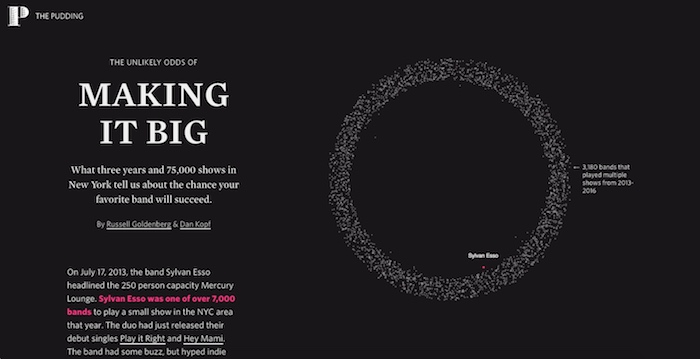
ORO The Unlikely Odds of Making it Big por Russell Goldenberg y Dan Kopf, The Pudding
PLATA OddityViz – a visual deconstruction of Space Oddity por Miriam Quick y Valentina D’efillipo
BRONCE An Interactive Visualization of Every Line in Hamilton por Shirley Wu, The Pudding
MENCIÓN DE HONOR Film Money por Lars Verspohl
Current Affairs & Politics
Works on news, politics, finance & economics

ORO On Their Way: the Journey of Foreign Fighters por Density Design
PLATA One Angry Bird por Periscopic
BRONCE Want to fix gun violence in America? Go local por The Guardian
MENCIÓN DE HONOR The Electoral College misrepresents every state, but not as much as you may think por Denise Lu, Washington Post
People, Language & Identity
Graphics on identity, drawing on personal & cultural data & the quantified self

ORO How do you draw a circle? por Thu-Huong Ha y Nikhil Sonnad,Quartz
PLATA What’s it like to get trolled all day long? por Harry Stevens,Piyush Aggarwal, Hindustan Times
BRONCE Data Futures por Dominikus Bar, Daniel Goddemeyer
MENCIÓN DE HONOR Life in Clay por Alice Thudt
Environments & Maps
Pieces on the natural & built environment, plus any map that doesn’t fit into other categories

ORO 1812: When Napoleon Ventured East por TASS
PLATA Lights on & Lights out por John Nelson
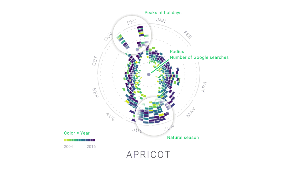
BRONCE Peak Spotting por Moritz Stefaner, Christian Laesser,StudioNAND
MENCIÓN DE HONOR Travel Visa Inequality por Christian Laesser
Humanitarian / Global
Graphics on NGOs, aid, welfare & global issues including natural or man-made disasters

ORO The Shadow Peace – The Nuclear Threat por Neil Halloran
PLATA The Point Of No Return – How the world is adapting to climate change por Density Design
BRONCE How a Melting Arctic Changes Everything por Eric Roston,Blacki Migliozzi, Bloomberg
MENCIÓN DE HONOR Those Who Did Not Cross por Levi Westerveld
MENCIÓN DE HONOR The Stories Behind a Line por Federica Fragapane
Science & Technology
Images on technology, science, medicine or health

ORO Science Paths por Kim Albrecht
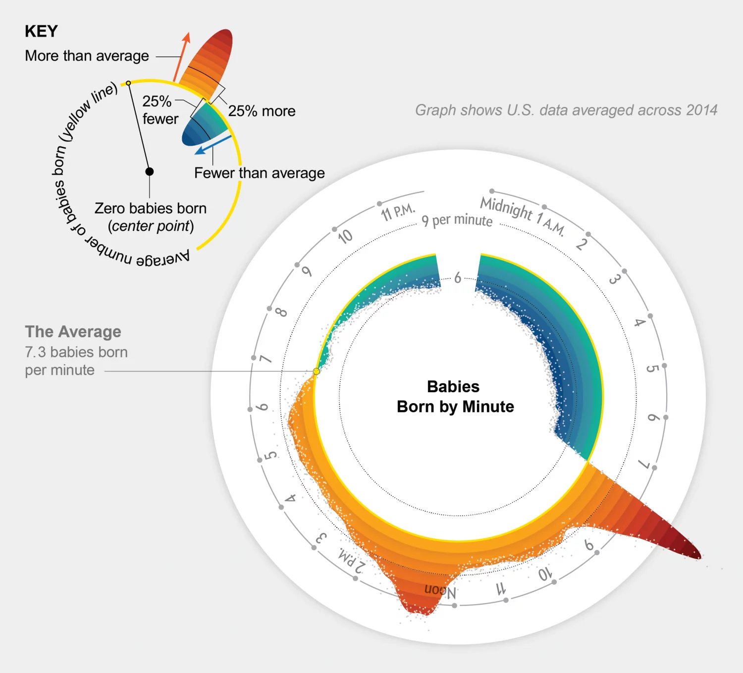
PLATA Why Are so Many Babies Born around 8:00 A.M.? por Nadieh Bremer, Zan Armstrong, Scientific American
PLATA Seeing Theory por Daniel Xiang
BRONCE Nutrition Label por Vivek Menon
MENCIÓN DE HONOR Apollo por Paul Button
MENCIÓN DE HONOR This is the tangled future of tech and transportation por Skye Gould, Business Insider
Sports, Games, & Leisure
Works on the subject of sports, games, & leisure activities
ORO Rhythm of Food por Moritz Stefaner, Yuri Vishnevsky
PLATA Swimming World Records throughout History por Irene de la Torre Arenas
BRONCE NYC Foodiverse por Will Su
BRONCE What city is the microbrew capital of the US? por Russell Goldenberg, The Pudding
MENCIÓN DE HONOR Berlin Marathon 2016: how fast your city runs por Berliner Morgenpost
Unusual
Anything that doesn’t fit into other categories
ORO Data Sketches in Twelve Installments por Nadieh Bremer, Shirley Wu
PLATA How To Fix a Toilet (And Other Things We Couldn’t Do Without Search) por Google News Lab, Xaquín González Veira
BRONCE Data Viz Project por Ferdio
MENCIÓN DE HONOR Forma Fluens por Mauro Martino
Studio of the Year
Most impressive multiple pieces by a commercial studio

Density Design for works including On Their Way: the Journey of Foreign Fighters y The Point Of No Return – How the world is adapting to climate change
Community Prize
Most votes from visitors to our site

ORO The Annual Report of the ERGO Hestia Group, “Network” por Hanna Dyrcz
PLATA Viz for Social Good por Chloe Tseng
BRONCE Han Chinese Opera por Peijie Li
BRONCE Surfing in Italy por Stefania Guerra, Michela Lazzaroni
Outstanding Individual
Nadieh Bremer por trabajos que incluyen Data Sketches in Twelve Installments y Why Are so Many Babies Born around 8:00 A.M.?
Rising Star

ORO Jory Fleming por trabajos que incluyen Gerrymandering: A Nation Divided, but Who’s Drawing the Lines?
PLATA Amy Cesal por trabajos que incluyen 50/30/20: Income and financial stability in America
BRONCE Nam Wook Kim por trabajos que incluyen Data Driven Guides
MENCIÓN DE HONOR Giacomo Flaim por trabajos que incluyen Are you sure you want to smoke?
Best Non-English Language Viz

ORO Berlin Marathon 2016: how fast your city runs por Berliner Morgenpost
PLATA Women Farmers in the Loneliness of Onion Fields por Agnès Stienne, VisionsCarto
BRONCE Creation of a Thank por Zhu Tianhang
BRONCE All the government barbecues por Rodrigo Menegat
+ Artículos


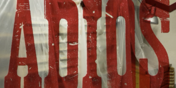
BunkerType anuncia su cierre tras casi 17 años de actividad dedicada a la tipografía y el letterpress
Jesús Morentin ha comunicado el cierre de BunkerType, el taller barcelonés que puso en marcha en 2009 como espacio de...
Leer